Color Contrast
What is Color Contrast?
Color contrast is the difference in brightness between colors in the foreground and background. When using colors, it is especially important to consider the color difference between text and its background, text and images, and sections depicting meaning in charts and maps. WCAG 2.1 AA gives us precise guidelines for accessible contrast ratios on websites.
- Images should have a contrast ratio of at least 4.5:1.
- Normal sized text should have a contrast ratio of at least 4.5:1
- Large sized text should have a contrast ratio of at least 3:1. Large sized text consists of an 18 pt font or higher or a 14 pt. font bolded.
- Text in logos do not have a contrast requirement.”
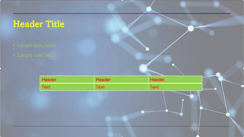
Color Contrast Example
Here is an example showing how difficult it is to read text with insufficient contrast.
Benefits of Color Contrast
Most people prefer good contrast – it’s easier for everyone to read. If you’ve ever sat through a slide presentation with poor contrast or used subtitles on a movie where the contrast was not high enough, you know how frustrating it can be to not be able to access the information being presented.
But poor contrast especially impacts people with low vision and with color blindness.
Color Contrast Guidelines
- Choose high-contrast color schemes. Warm and cool colors make for the best color contrast.
- Black text on a white background offers the best color contrast
- Avoid white text on a black background, as it creates a visual fuzzing effect known as “halation” for people with corrective lenses.
- Avoid green-red and yellow-blue color combinations, as they present challenges to many with color blindness.
- Use large text and simple fonts. San serif fonts are easiest to read.
- Use bold instead of color for emphasis.
- Don’t rely on color as the sole means of conveying information. Color should not be the only method used to indicate emphasis, heading levels, or links.
- Set text against solid backgrounds. Photographic and gradient backgrounds can make text difficult to read.
Check Color Contrast
Use a dedicated color contrast checking tool to check color contrast in your files. WebAIM offers a manual color contrast checker where you input foreground and background color values (like hex codes) to receive a contrast ratio indicating whether the color combination meets accessibility standards. Other tools such as the WAVE Evaluation Tool and ARC Toolkit are browser extensions that extract color values directly from your page or file.
Resources
- Watch TTaDA's Introduction to Color.
- Watch TTaDA's Introduction to Using Color in Blackboard Ultra.