Microsoft Word
Action Items
Ensuring accessibility in Word is essential for creating inclusive and usable documents. Refer to the Accessibility Checklist for Microsoft Word to verify that your file meets the needs of all readers. In addition, Word users must complete the following action items to fully achieve accessibility standards.
All documents should have the title and language set in Document Properties. The title should be concise and meaningful, reflecting the document's purpose. The title can be used to quickly identify the intent of a document without opening it. Meanwhile, the document language indicates the spoken language in which the text is written. Correctly set language properties allow screen readers and assistive technologies to accurately read and interpret the content.
Add Metadata
A document's title and language is part of its metadata. Metadata is the descriptive information embedded within a file that helps identify and organize the document. This data is not visible to the eye; rather, it is contained within the code. Additional metadata includes the author's name, a subject description, and keywords. This metadata helps users and systems quickly locate the document in a library, database, or search engine by matching the keywords to search queries. In Word, this additional data can be entered in the same dialogue box as the document title.
Headings are signposts that structure text documents and allow readers to more easily navigate their way around a document. More than simply just bolded or italicized words, headings provide extra information about the structure of the document at the code level. To enable screen readers to read your Word files correctly, you will need to create headings that identify titles and major sections of your document.
Demonstration: Creating Headings in Microsoft Word
Watch TTaDA's Introduction to Creating Headings in Microsoft Word.
Using Styles to Apply Headings
Creating headers in Word involves more than simply bolding or emphasizing text. Instead, headings are managed by what word calls styles, built-in formatting characteristics that can easily be applied to text. Styles can be applied one of two ways in Word.
Using the Styles Ribbon
Select the appropriate heading level using the Styles toolbar on the Home Ribbon.

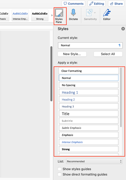
Using the Styles Pane
If you prefer, you can also open the Styles options in a pane at the side of your screen. Select the Styles Pane at the right-hand side of the Styles Ribbon. The pane will open on the right-hand side of your document.
Modifying Styles
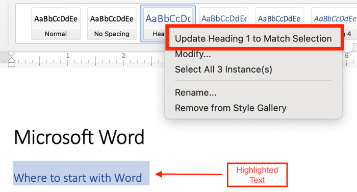
Word Headings are preformatted, but you can easily customize the visual appearance of your headings across an entire document. Take Heading 1 as an example:
- Set the font, color, spacing, etc., to what you would like Heading 1 to be.
- Highlight the correctly formatted text.
- Right-click on Heading 1 in the Ribbon (or the Styles Pane), and click Update Heading 1 to Match Selection.
- Now each Heading 1 will use your preferred formatting. You should see that all Heading
1 text has changed throughout your document. (You can also
click Modify for more formatting options.)
Use built-in list styles to create numbered and bulleted lists instead of manually formatting with numbers, symbols, or tabs. Avoid excessive bullet levels, as each level is announced by screen readers (e.g., “list level 1, list level 2”) and can overwhelm users, making navigation difficult.
Alternative text (or alt-text) is the short written description that typically appears in place of an image on a webpage or in a document. The purpose of alt-text is to textually describe a visual image in such a way that someone who can't see the image can understand that image's meaning. This is especially important for screen reader users. When screen readers encounter images in word, they read them as images. Unless alternative text (alt-text) describing what is in the image, chart, or graph is provided, a screen reader will simply announce “Image” and move on.
Automatic Alt-Text
Microsoft Office automatically generates alt-text for images, either using artificial intelligence, or inserting the filename or URL that the image originally came from. Automatically generated alt-text is, at best, only a guestimate. At its worst, automatic alt-text is actually more harmful than helpful. It's important to check alt text manually to ensure that if offers a helpful description.
Resources
Complex images—such as graphs, charts, diagrams, and maps—convey substantial information that cannot be communicated in brief alt text. In these cases, a long description is required to ensure all users, including those using screen readers, can access information conveyed by an image.
Accessible Complex Images
To make a complex image accessible, you should:
- Use a static, flattened image: do not embed graphs or interactive charts in your document, as these often exist on separate drawing layers that are not accessible to screen reader users. Instead, take a screenshot of the chart or graph, and use that image. The image should be a single, non-interactive object.
- Add a descriptive caption: include an image ID and a brief explanation of what the image shows (e.g., Figure 1: Map of Greece or Table 3: Revenue Growth in Quarter 3).
- Provide alternative text: this text should be short and formulaic. Reference the image ID, and direct users to where the long description can be found (e.g., Figure 1. See below for detailed description).
- Provide a detailed long description: this should convey all meaningful content and relationships shown in an image.
Formats for Long Description
Long descriptions in Microsoft Word can take different formats depending on the complexity of the image and the context. These include:
- Paragraph(s) of text
- A simple table
- A list of data points
- Appendices
- Links to an external websites
Where to Place Long Descriptions in Microsoft Word
Because long descriptions are rather lengthy and detailed, they can’t be put into alt text fields. Instead, you’ll need to decide where to put them. You have two options:
- Describe the image in the surrounding text. Screen readers will benefit from this placement, as will other readers.
- If your space is limited, you can create an appendix that contains the long description. If you go with this option, make sure you link from the original location to the appendix AND link from the appendix to the original text. That way, users can easily navigate back and forth between the original text, image, and description.
Long Description Example
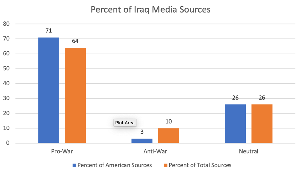
Consider this chart. There are three ways to provide long description.
Resources
When creating tables in Word, simplicity is key. Complex table designs can confuse users of assistive technologies. To ensure table accessibility, follow these best practices:
- Build all tables in the original document. Avoid drawing, importing, or inserting tables as an image file.
- Use tables for data only, not for layout purposes.
- Use a simple table structure with a clearly marked header row and first column.
- Ensure that table header rows repeat across pages.
- Avoid using blank, merged, and split cells. These can create issues for screen reader users, who may not be able to navigate the table in a logical reading order.
Setting Table Header Row
A table header row is the top row of a table that acts as a title for the type of information users will find in each column. You are probably used to bolding or italicizing information in table header rows, but this alone does not enable screen readers to recognize and read aloud header information. Table headers must be marked at the code level so the change is structural. You can't tell from looking at a table if it's been manually bolded or not - but screen readers will read structural headers aloud, aiding in ease of navigation and accuracy.
To set the Table Header Rows, you’ll need to configure settings in two places: Table Properties and Table Design Tools.
Repeating Table Header Rows Across Pages
When working with a long table that spans multiple pages, screen reader users may struggle to remember how data is organized across pages. To simplify navigation and improve accessibility, set the table to automatically repeat header rows on each page. This helps users maintain context and ensures the table is easier to navigate.
Descriptive links provide users with proper context for links. In other words, they tell the user exactly where they will go if they click on a descriptive link. This ensures all users can easily understand and navigate your document. Descriptive link text is especially important for people using assistive technology. Screen reader users navigate documents by either tabbing through links or viewing a links list, which takes the link out of the context of the surrounding text. Additionally, people using voice recognition also rely on precise link text to navigate efficiently.
- For more information on descriptive links, download our Guide to Writing Descriptive Links.
Ensure that text, diagrams, charts, and other meaningful content meet a contrast ratio of at least 4.5:1 for regular text. For large text (18+ pt or 14+ pt bold), a minimum contrast ratio of 3:1 is acceptable. Use online contrast checkers like WebAIM to ensure compliance with accessibility standards.
For documents spanning multiple pages, include a Table of Contents via the Review tab. Microsoft Word's Table of Contents serves as a navigational guide by using heading structure to create internal links that allow readers to quickly jump to relevant parts of a document. Benefits of Microsoft Word's Table of Contents include automatic updates to format and style when heading text, sequence, or level change.
The reading order of a document or presentation determines the order that a screen reader will read out content. Users who use screen readers can easily become confused, lost, or miss parts of the content entirely if the reading order of a document is incorrect. Verifying the reading order is imperative to ensuring that all students have equal access to the materials. Even if objects in your document or presentation appear to be ordered logically, you should always manually check the reading order.
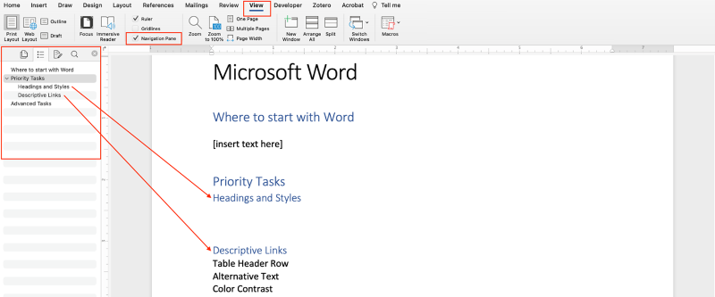
Navigation Pane
In Word, the Navigation Pane can be used to check reading order, reorganize document parts, and browse document content. The Navigation Pane displays a hierarchical list of headings and pages that essentially serves as a visual outline of your document. To launch the Navigation Pane, go to View and check the box beside Navigation Pane. The Navigation Pane will open on the left.
- Click on any of the headings in the Navigation Pane to go to that section.
- To re-order your content, drag the headings up and down in the navigation pane
Run the Accessibility Checker to test for accessibility issues. This checker scans your document for potential issues that might prevent people with disabilities from accessing the content properly. It will highlight the issues, provide suggestions on how to fix them, and then prompt you to fix these issues.
There are several ways to convert Microsoft Documents to a PDF, but not all ways preserve the accessibility of the original document in PDF form. When saving your Word document as a PDF, avoid the Print to PDF option. This option only translates information you would see on a printed page. It strips the document of all metadata, links, bookmarks, and heading structures. Opt for the Save as PDF option instead.
Demonstration: Word to PDF
Watch TTaDA's Introduction to Exporting Word Documents to PDFs.
Resources
On-Demand Training
Deque University
As part of its effort to meet the Title II ADA Digital Accessibility requirements, UND has partnered with Deque University to provide an expansive selection of on-demand digital accessibility training modules to all UND employees. Explore accessibility in Microsoft Word by taking the self-paced training, MS Word Accessibility Techniques.
MS Word Accessibility Techniques (Office 365)
OR
MS Word 2016 Accessibility Techniques (Office 2016)
Infobase
Infobase provides online training solutions that answer "How do I do that?" Learn how to create inclusive and accessible digital documents in Microsoft Word 365 that comply with Section 508 of the Rehabilitation Act and the 2024 updated final rule of Title II of the Americans with Disabilities Act. This course covers key techniques for improving document accessibility.
Making Word Documents Accessible (2025)
Recorded Workshop
Wondering why your Word document is receiving a low score in Blackboard Ally? This workshop will guide participants through identifying and addressing common accessibility issues in Microsoft Word documents. Issues include alt-text for images, heading structure, tables, links, and lists. A hands-on tutorial will walk you through addressing these issues in a sample document, demonstrating how to leverage Word's Accessibility Checker tool to fix accessibility errors.
Word Document Accessibility 101
UND Branded Template
Use UND-branded, accessible templates to maintain consistency. UND offers a variety of Word templates, each tailored to fulfill a specific purpose.
We use cookies on this site to enhance your user experience.
By clicking any link on this page you are giving your consent for us to set cookies, Privacy Information.