Ensuring accessibility in PowerPoint is essential for creating inclusive and usable
presentations. Refer to theAccessibility Checklist for Microsoft PowerPointto verify that your file meets the needs of all readers. In addition, PowerPoint users
must complete the following action items to fully achieve accessibility standards.
All documents should have thetitle and languageset in Document Properties. The title should beconcise and meaningful, reflecting the document's purpose. The title can be used to
quickly identify the intent of a document without opening it. Meanwhile, the document
language indicates the spoken language in which the text is written. Correctly set
language properties allow screen readers and assistive technologies to accurately
read and interpret the content.
Add Metadata
A document's title and language are part of its metadata. Metadata is the descriptive
information embedded within a file that helps identify and organize the document.
This data is not visible to the eye; rather, it is contained within the code. Additional
metadata includes the author's name, a subject description, and keywords. This metadata
helps users and systems quickly locate the document in a library, database, or search
engine by matching the keywords to search queries. In PowerPoint, this additional
data can be entered in the same dialogue box as the document title.
In PowerPoint, slide titles serve as Headings, guiding viewers through a presentation's structure. Beyond formatting elements (bolded
or italicized words), slide titles provide critical metadata regarding the structure
and organization of the presentation at the code level. To enable screen readers to
read your PowerPoint slides correctly, you will need to create unique headings identifying
slide titles and major section breaks. For more information, see Microsoft Support's
documentation on Slide Titles.
Adding Titles to Slides
There are multiple ways to add titles to your slides in PowerPoint.
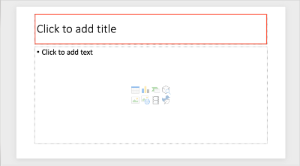
The most straightforward way to add a title is to use the Click to add title field at the top of each slide.
PowerPoint's pre-set slide layouts are designed with formatting, color schemes, and
reading orders that are optimized for screen readers. These templates help establish
a consistent reading order that ensures content is presented logically and can be
easily interpreted by assistive technologies. By utilizing these layouts, presenters
avoid the need to design each slide, minimizing the risk of design-related accessibility
issues. Ultimately, this saves time and ensures that all users can effectively engage
with the content.
Using Pre-Set Slide Layouts
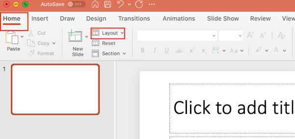
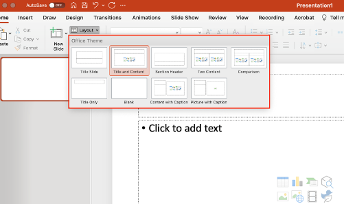
To use pre-set slide layouts that have the reading order already established, go to
Home and select the Layout drop down menu.
Select the layout that best matches your content needs.
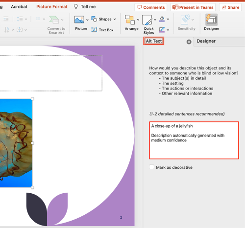
Alternative text(or alt-text) is the short written description that typically appears in place of
an image on a webpage or in a document. The purpose of alt-text is to textually describe
a visual image in such a way that someone who can't see the image can understand that
image's meaning. This is especially important for screen reader users. When screen
readers encounter images in PowerPoint, they read them as images. Unless alternative
text (alt-text) describing what is in the image, chart, or graph is provided, a screen
reader will simply announce “Image” and move on.
Add Alternative Text
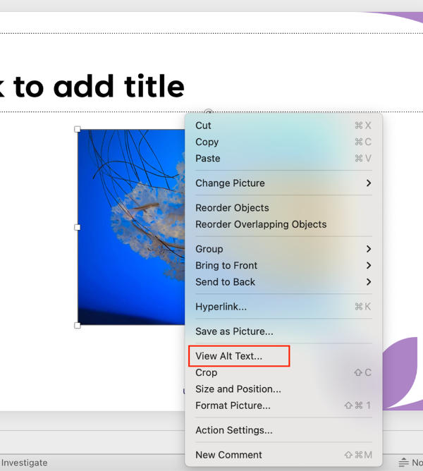
To set alternative text for an image in PowerPoint,
Right-click on your image.
Select Edit Alt Text (Windows) / View Alt Text (Mac) from the menu. An Alt TextPane will open on the right-hand side of the screen.
Type your alt-text into the text box. This text will auto save.
Important note: Microsoft PowerPoint usually attempts to generate automatic alt-text. These auto alt-texts
are generally inaccurate. It is always best to edit the alt-text yourself.
Microsoft Office automatically generates alt-text for images, either using artificial
intelligence, or inserting the filename or URL that the image originally came from.
Automatically generated alt-text is, at best, only a guestimate. At its worst, automatic
alt-text is actually more harmful than helpful. It's important to check alt text manually
to ensure that if offers a helpful description.
Complex images—such as graphs, charts, diagrams, and maps—convey substantial information
that cannot be communicated in brief alt text. In these cases, a long description
is required to ensure all users, including those using screen readers, can access
information conveyed by an image.
Accessible Complex Images
To make a complex image accessible, you should:
Use a static, flattened image: do not embed graphs or interactive charts in your document, as these often exist on
separate drawing layers that are not accessible to screen reader users. Instead, take
a screenshot of the chart or graph, and use that image. The image should be a single,
non-interactive object.
Add a descriptive caption:include an image ID and a brief explanation of what the image shows (e.g.,Figure 1: Map of GreeceorTable 3: Revenue Growth in Quarter 3).
Provide alternative text: this text should be short and formulaic. Reference the image ID, and direct users
to where the long description can be found (e.g., Figure 1. See below for detailed description).
Provide a detailed long description:this should convey all meaningful content and relationships shown in an image.
Formats for Long Description
Long descriptions in Microsoft Word can take different formats depending on the complexity
of the image and the context. These include:
Paragraph(s) of text
A simple table
A list of data points
Notes
Where to Place Long Descriptions in Microsoft PowerPoint
Because long descriptions are rather lengthy and detailed, they can’t be put into
alt text fields. Instead, you’ll need to decide where to put them. You have a few
options:
Describe the image on either the same slide or the following slide. Screen readers
will benefit from this placement, as will other readers.
Add the long description to the speaker notes section of a slide. The long description
will not be visible in Presenter Mode, but students will still be able to access it
when reviwing slides on their own.
If your space is limited, you can create an appendix slide that contains the long
description. If you go with this option, make sure you link from the original slide
to the appendix slide AND link from the appendix slide back to the original slide.
That way, users can easily navigate back and forth between the original text, image,
and description.
Attach a video where an image has been described in full—for example, a lecture video.
Please note that you must describe the image in full detail. You will also need to indicate the title of the
video and provide an exact timestamp for the long description in the alternative text
(e.g. See full image description in [Video Title] at 03:28).
Demonstration: Introduction to Accessible Complex Images
When creatingtablesin PowerPoint, simplicity is key. Complex table designs can confuse users of assistive
technologies. To ensure table accessibility, follow these best practices:
Build all tables in the original document. Avoid drawing, importing, or inserting
tables as an image file.
Use tables for data only, not for layout purposes.
Use a simple table structure with a clearly marked header row and first column.
Avoid using blank, merged, and split cells. These can create issues for screen reader
users, who may not be able to navigate the table in a logical reading order.
Setting Table Header Row
A table header row is the top row of a table that acts as a title for the type of
information users will find in each column. You are probably used to bolding or italicizing
information in table header rows, but this alone does not enable screen readers to
recognize and read aloud header information. Table headers must be marked at the code
level so the change is structural. You can't tell from looking at a table if it's
been manually bolded or not - but screen readers will read structural headers aloud,
aiding in ease of navigation and accuracy.
Instructions to Set a Table Header Row:
Select the table. Click anywhere inside the table to do this.
Go to Table Design in the top ribbon.
Check the box by Header Row in the upper-left-hand corner of the ribbon.
Instructions to Set a First Column:
If you have created a table that also provides labels for data cells in the first
column:
Select the table.
Go to Table Design in the top ribbon.
Check the box by First Column in the upper-left-hand corner of the ribbon.
Descriptive linksprovide users with proper context for links. In other words, they tell the user exactly
where they will go if they click on a descriptive link. This ensures all users can
easily understand and navigate your document. Descriptive link text is especially
important for people using assistive technology. Screen reader users navigate documents
by either tabbing through links or viewing a links list, which takes the link out
of the context of the surrounding text. Additionally, people using voice recognition
also rely on precise link text to navigate efficiently.
Ensure that text, diagrams, charts, and other meaningful content meet acontrast ratioof at least 4.5:1 for regular text. For large text (18+ pt or 14+ pt bold), a minimum
contrast ratio of 3:1 is acceptable. Use online contrast checkers likeWebAIMto ensure compliance with accessibility standards.
One way to ensure color contrast in in your PowerPoint slide presentations is to use
a template with good color contrast. Good templates will avoid the following:
Gradients, where color is lighter and gradually gets darker.
Avoid using color alone to convey emphasis. Screen reader users may not be aware when
text is colored, and color-blind users might struggle to differentiate between colors.
Use other methods of emphasis, such as bold or italics, in addition to color.
SmartArt is a tool in Microsoft Office that turns text into visuals like flowcharts, hierarchies,
and diagrams—perfect for making ideas easier to understand and more engaging. While
SmartArt in Microsoft PowerPoint is generally more accessible to screen reader users
than SmartArt in Microsoft Word, it still has many accessibility limitations. Screen
reader users may struggle to understand relationships between objects—such as hierarchy
or process between elements.
Make SmartArt Accessible
SmartArt is considered accessible when users—especially those using screen readers—can
meaningfully interpret both the content and the relationships between elements in
the graphic. Accessibility in SmartArt can be enhanced by ensuring the following:
Alternative text for the grouped graphic
Alternative text for individual images
Adequate color contrast
Logical and meaningful reading order
Accessible SmartArt Graphic Templates
Some SmartArt templates in PowerPoint come with a logical and meaningful reading order
already established, making them more accessible for screen reader users. The templates
listed below generally follow a predictable structure and work well without additional
adjustments.
Lists
Basic Block
Alternating Hexagons
Vertical Bullet
Horizontal Bullet
Stacked List
Grouped List
Vertical Block
Vertical Chevron
Vertical Arrow
Trapezoid
Descending Block
Table
Processes
Basic Process
Accent Process
Vertical Process
Staggered Process
Basic Chevron Process
Closed Chevron Process
Chevron Process
Vertical Chevron
Basic Bending
Vertical Bending
Vertical Arrow
Cycle
Basic Cycle
Multidimensional Cycle
Basic Pie
Basic Radial
Diverging Radial
Hierarchy
Horizontal Multi-level Hierarchy
Horizontal Hierarchy
Matrix
Titled Matrix
Grid Matrix
Pyramids
Basic Pyramid
Inverted Pyramid
Photo-Based SmartArt
SmartArt that includes embedded or decorative photos often results in an illogical
reading order. Photos are frequently prioritized by screen readers, causing disconnection
from associated text and disrupting comprehension. When accessibility is a priority,
it's best to choose text-based or shape-based templates over photo-based templates.
Making Other SmartArt Templates Accessible
Templates not listed above can still be made accessible with some manual adjustments. Consider the following strategies:
Mark Decorative Elements as Decorative: Shapes that are purely visual (e.g., floating arrows, timeline markers, decorative
symbols like “+” or “=”) can be marked as decorative so that screen readers skip them.
Enhance Alternative Text: If you hide decorative elements from screen readers, you will need to elaborate
on the relationship in the overall alternative text.
Thereading orderof a document or presentation determines the order that a screen reader will read
out content. Users who use screen readers can easily become confused, lost, or miss
parts of the content entirely if the reading order of a presentation is incorrect.
Verifying the reading order is imperative to ensuring that all students have equal
access to the materials. Even if objects in your presentationappearto be ordered logically, you should alwaysmanuallycheck the reading order.
Selection Pane
In PowerPoint, the Selection Pane can be used to check reading order and reorganize
presentation elements. The Selection Pane displays all slide elements in the order
that a screen reader would read them. It is important to note that the reading order
in PowerPoint is from bottom-to-top, with the bottom item being the first item read.
To launch the selection pane, go to the Home tab and select the drop-down menu next to Arrange. Select Selection Pane. The Selection Pane will open on the left.
Click on any of the elements in the Selection Pane to select that element on your
slide. To re-order your content, drag and drop the elements within the Selection Pane.
Group Objects Together
To simplify the reading order, group objects together. Grouping objects together can
help screen reader users understand the relationship between images on a slide. Furthermore,
it helps reduce the number of objects needed to be ordered in the Selection Pane.
For more information, visit Microsoft Support's page on Grouping and Ungrouping Shapes, Pictures, and Other Objects.
Delete Empty Elements
Ensure that all empty elements are deleted. If elements are left empty but not deleted,
screen readers will detect these elements and read them as “empty.” This may overwhelm
or annoy screen reader users.
Run the Accessibility Checker to test for accessibility issues. This checker scans
your presentation for potential issues that might prevent people with disabilities
from accessing the content properly. It will highlight the issues, provide suggestions
on how to fix them, and then prompt you to fix these issues. For more information,
see Microsoft's Support documentation on Improving Accessibility with the Accessibility Checker.
There are several ways to convert Microsoft PowerPoint presentations to PDFs, but
none of these ways preserve the accessibility of the original document in PDF form.
Exporting a PowerPoint to a PDF will strip the PowerPoint of all metadata, links, bookmarks, and heading structures. For this reason, it is best to upload and share PowerPoint presentations in their
original source format. If security or notes are a concern, you may share different
versions of your PowerPoint.
As part of its effort to meet the Title II ADA Digital Accessibility requirements,
UND has partnered with Deque University to provide an expansive selection of on-demand
digital accessibility training modules to all UND employees. Explore accessibility
in Microsoft PowerPoint by taking the self-paced training, MS PowerPoint Accessibility
Techniques.
Infobase provides online training solutions that answer "How do I do that?" In this
course, you will learn how to create presentations in Microsoft PowerPoint 365 that
comply with Section 508 of the Rehabilitation Act and the updated 2024 Final Rule
of Title II of the Americans with Disabilities Act. You’ll learn tools and practices
that ensure your content is usable by all audiences, including those with disabilities.
Curious why your PowerPoint presentation is receiving a low score in Blackboard Ally? This workshop guides participants through identifying and addressing common accessibility
issues in Microsoft PowerPoint, such as reading order, missing alt text, and color contrast. A hands-on tutorial
will walk you through a sample presentation, demonstrating how to leverage PowerPoint’s
Accessibility Checker to fix accessibility errors.
Use UND-branded, accessible templates to ensure consistency. Two PowerPoint templates
are available; TTaDA recommends using the Vibrant PowerPoint Template for optimal
accessibility.