Common Accessibility Issues
Explore common accessibility issues that affect various types of content, including websites, PDFs, and other document formats. Understanding these fundamental issues can help you make changes that ensure all users can access and engage with your content effectively.
What is Alternative Text?
Sometimes called “alt tags” and “image descriptions,” alt text is the short, written description that typically appears in place of an image on a webpage or in a document.
Alt text is different from captions, which typically provides source identification and credit. The purpose of alt text is to textually describe a visual image in such a way that someone who can't see the image can understand that image's meaning.
Simple Alt Text Example
The following is an example of simple alt text that describes a photo. Please note: the alt text for this photo looks like a caption for illustrative purposes. Alt text is not normally displayed with images.
 Alternative Text: One of the bridges over the Red River in Grand Forks, ND. Behind the bridge is a
brilliant blue sky with a few clouds hovering nearer the horizon. In the foreground,
a person is walking along a path toward the bridge.
Benefits of Alt Text
- For users with visual impairments, alt text can be read aloud by screen readers. Note: if an image is complex, long description may be needed in addition to alt text.
- Written descriptions can help users process complex visual information by presenting it in multiple ways.
- Alt text is available to search engines, increasing a website’s search engine optimization.
- It can be used for voice navigation on graphical links.
- When images don’t load, alt text is displayed. This is particularly helpful when access to the internet is limited, and a broken image is displayed.

Alt Text Guidelines
Alternative text should be both concise and meaningful to the listener. It conveys the purpose of an image, not every detail. Consider the following when writing alt text:
- Be concise – no longer than 120 characters.
- Consider the target audience. How much knowledge do you expect the audience to have on the topic?
- If the image is also a link, the alt text should describe the link target.
- If there is text in the image, include it in the alt text.
- Avoid redundant statements like “Image of” or “This is a picture of.” A screen reader will already announce that it is an image.
- If the image is already described in the surrounding text, the alt text can be very short.
- If an image is purely decorative, mark it as such (various methods depending on software).
- What is the context of the image? What meaning does it add to the page? Describe only what you expect visual users to get out of the image.
A Note About Automatic Alt Text
In many cases, programs such as Microsoft Word or PowerPoint, will automatically generate alt text for images, either using artificial intelligence, or inserting the filename or URL that the image originally came from. Automatically generated alt text is, at best, only a guestimate. At its worst, automatic alt text is actually more harmful than helpful. It's important to check alt text manually to ensure that if offers a helpful description.
Resources
For guidance on adding alternative text in Word, Excel, PowerPoint, and Adobe Acrobat documents, see TTaDA's Accessibility Resource Index.
Video Captions
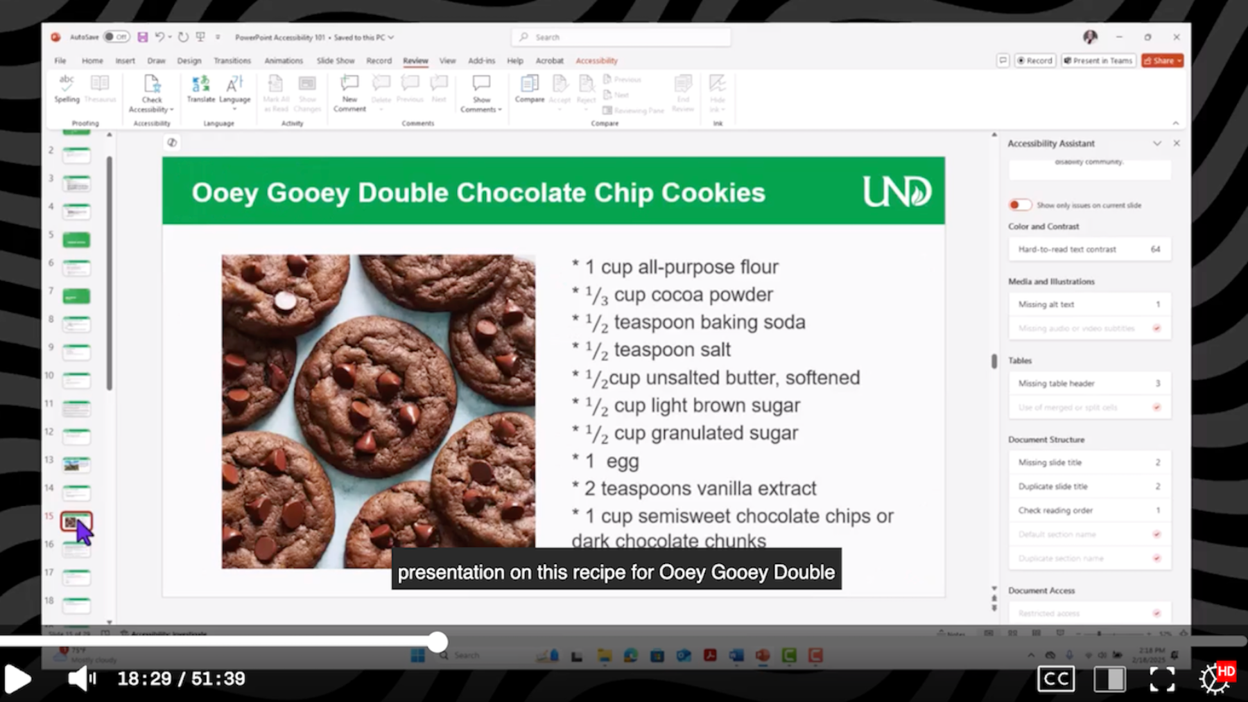
Often called subtitles, video captions provide visual alternatives to audio information. The caption text is typically displayed below the video so you can see the video synchronized with the text.
Video Caption Example
Who Benefits?
Captions provide an alternative to audio that helps all types of users, including:
- Deaf or hard of hearing
- English language learners
- Learning disabilities
- Visual or multi-modal learners
Additionally, captions or subtitles also help users who are:
- Watching videos in noisy environment
- Watching videos in quiet environment
- Scrolling on social media
- Deciphering unfamiliar accents
What Guidelines Should I Follow?
- Imagine that you can’t hear and include whatever sounds you need to understand the meaning of the video.
- Include all sounds, including stutters, pauses, etc. So, if a speaker pauses and makes a sound, you can use an “erm,” or a “hmmm” in the caption text.
- Include background sounds whenever necessary to understand the meaning of the video.
- Punctuation matters. For example, the following two sentences have the same words
but wildly different meanings.
- “Let’s eat grandma!”
- “Let’s eat, Grandma!”
- Whenever possible, synchronize the caption with the action on the screen.
- Watch your color contrast. If a white caption appears on a white or light-colored section of the video background, it will be difficult, if not impossible, to read.
Is Automatic Captioning Accurate?
Captions benefit a wide variety of users, but they can only do so if they are accurate. Many video platforms, including YuJa, provide automated captioning. While automatic captions can help cut down the time needed to provide accurate captioning, be aware that auto-captioning relies on machine-generated algorithms that are never 100% accurate. For example, videos captioned in YuJa are supposed to be 90% accurate, but they often fall considerably short of this because of variances in recording environment, accents, and other complicating factors.
Auto-captions must be accurate to be usable. Oftentimes, that requires manual editing.
Resources
For help with specific products, please see the links below:
What is Color Contrast?
Color contrast is the difference in brightness between colors in the foreground and background. When using colors, it is especially important to consider the color difference between text and its background, text and images, and sections depicting meaning in charts and maps. WCAG 2.1 AA gives us precise guidelines for accessible contrast ratios on websites.
- Images should have a contrast ratio of at least 4.5:1.
- Normal sized text should have a contrast ratio of at least 4.5:1
- Large sized text should have a contrast ratio of at least 3:1. Large sized text consists of an 18 pt font or higher or a 14 pt. font bolded.
- Text in logos do not have a contrast requirement.
Color Contrast Example
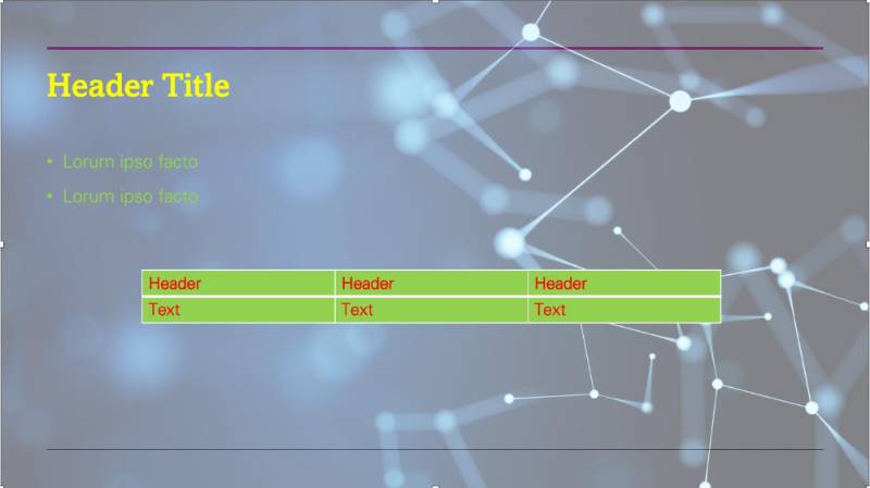
Here is an example showing how difficult it is to read text with insufficient contrast.
Benefits of Color Contrast
Most people prefer good contrast – it’s easier for everyone to read. If you’ve ever sat through a slide presentation with poor contrast or used subtitles on a movie where the contrast was not high enough, you know how frustrating it can be to not be able to access the information being presented. Poor contrast particularly impacts people with low vision and with color blindness.
Color Contrast Guidelines
- Choose high-contrast color schemes. Warm and cool colors make for the best color contrast.
- Black text on a white background offers the best color contrast
- Avoid white text on a black background, as it creates a visual fuzzing effect known as “halation” for people with corrective lenses.
- Avoid green-red and yellow-blue color combinations, as they present challenges to many with color blindness.
- Use large text and simple fonts. San serif fonts are easiest to read.
- Use bold instead of color for emphasis.
- Don’t rely on color as the sole means of conveying information. Color should not be the only method used to indicate emphasis, heading levels, or links.
- Set text against solid backgrounds. Photographic and gradient backgrounds can make text difficult to read.
Check Color Contrast
Use a dedicated color contrast checking tool to check color contrast in your files. WebAIM offers a manual color contrast checker where you input foreground and background color values (like hex codes) to receive a contrast ratio indicating whether the color combination meets accessibility standards. Other tools such as the WAVE Evaluation Tool and ARC Toolkit are browser extensions that extract color values directly from your page or file.
What are Descriptive Links?
Descriptive links provide users with proper context for links. In other words, they tell the user exactly where they will go if they click on a descriptive link. Good descriptive links will make sense if they are removed from the surrounding text. In contrast, non-descriptive link text is unclear and difficult to read where it leads; it will not make sense if removed from surrounding text.
Descriptive link examples
These non-descriptive links both point to the same destination:
- Ambiguous version: Read More
- Long URL: https://ndusbpos-my.sharepoint.com/:w:/r/personal/kristi_embry_ndus_edu/_layouts/15/Doc.aspx?sourcedoc=%7BE19F30C8-9FC9-42A9-A383-2635D3475F5F%7D&file=guide%20to%20descriptive%20links.docx&action=default&mobileredirect=true
This is a much better example of a descriptive link: Guide to Writing Descriptive Links
Benefits of Descriptive Links
There are several benefits to using descriptive links:
- Screen reader users navigate documents by either tabbing through links or bringing up a links list. This takes the links out of the context of the surrounding text.
- People using voice recognition can also use link text to jump directly to a specific link using speech.
- Making links descriptive ensures that everyone knows where a link will take them and can help everyone navigate documents more readily.
Writing Descriptive Links
In many cases, the descriptive link text you need is already in your content. All you have to do is emphasize it as a link. To ensure you are emphasizing links properly, reserve underlining only for hyperlinks. Avoid ambiguous language like “click here” or “read more.”
Use this: Learning how to write descriptive link text can be confusing, but you can learn more by visiting our Guide to Writing Descriptive Links.
Resources
- Consult TTaDA's Guide to Writing Descriptive Links.
- For guidance on creating descriptive links in Word, Excel, PowerPoint, and Adobe Acrobat, see TTaDA's Accessibility Resource Index.
Title
Document titles are crucial in enhancing the user experience. By selecting a concise and meaningful title that accurately reflects the document's purpose, users can quickly identify the intent of a document without opening it. A descriptive document title benefits all users, especially those using assistive technology. Screen reader users depend on clear titles to navigate and comprehend documents effectively.
It is important to note that a document's title is different than its file name or heading title. The title is part of a document's metadata, attributes used in organizing and identifying files at the code level. The file name is merely a technical identifier for saving a document to the computer. Meanwhile, the heading title is the headline of a document's content.
Setting a Title
The process for setting document titles varies across software suites. For example, the process between setting a title in Microsoft Word differs from Adobe Acrobat. Moreover, there are significant variations in user functionality between Windows and Mac environments.
For guidance on how to set your document titles in Word, Excel, PowerPoint, and Adobe Acrobat, see TTaDA's Accessibility Resource Index.
Language
Specifying a document's language is vital in creating an inclusive digital experience. The document language indicates the spoken language in which the text is written. When language properties are correctly set, screen readers and assistive technologies can accurately interpret content, ensuring content is read with proper pronunciation and accent. Additionally, language settings can be adjusted to recognize multiple languages within the same document when necessary.
Setting the Language
Like setting the document tile, the process for setting the document language varies across software suites and operating systems.
For guidance on how to set your document language in Word, Excel, PowerPoint, and Adobe Acrobat, see TTaDA's Accessibility Resource Index.
What are Headings?
Headings are signposts that structure text documents and allow readers to more easily navigate their way around a document. More than simply just bolded or italicized words, headings provide extra information about the structure of the document at the code level. Headings nest under one another based on their rank (or level). The most important heading has the rank of 1 (<h1>). Heading 1 is often used to denote the title. Additional headings range from 2 (<h2>) through 6 (<h6>). Skipping heading levels can be confusing and should be avoided when possible. For example, we wouldn’t want to skip from a heading 2 (<h2>) to a heading 5 (<h5>) in a particular section. However, you may skip headings in the opposite direction, if the outline calls for it. For example, you may skip from heading 4 (<h4>) to heading 2 (<h2>) to denote a new section has begun.
Headings Example
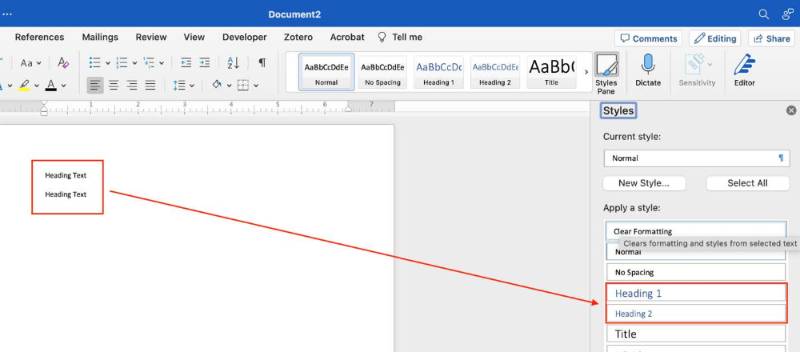
Creating headings is more involved than simply bolding or emphasizing heading or title information. In Microsoft Office products (including Word), you can only create headings using the Styles feature. The image below shows where to create headings in Word’s Styles pane.
Benefits of Headings
Headings are incredibly useful for both readers and writers. Headings may generate a Table of Contents or an interactive outline that anyone can use in documents such as Word and PDF.
For Readers
Headings can help with the following reading strategies:
- Getting an overview of the content before reading
- Scanning for important content
- Jumping to a particular section
- Breaking the reading into manageable chunks
- Easily referring back to a section when reviewing or studying
For Writers
When writers use real, structural headings (instead of just bolded or enlarged text), they can:
- Save time on organizing content before and while writing
- Generate a Table of Contents and an interactive outline in Word
- Easily navigate, reorder, and delete content
- More efficiently format content throughout the document
Headings Guidelines
You can apply the concept of headings to almost every kind of electronic content, including content in Word documents, on the web, and in Blackboard courses. Look for menus that allow you to select headings in any text editor you use.
- Don’t try and create headings by bolding, italicizing, or using colorful text. Screen readers will not have access to this information and will not be able to read or “scan” a document
- Use headings to provide a page structure or outline.
- Use headings to indicate sections of content.
- Nest appropriately in a hierarchy – avoid skipping levels.
- Avoid using headings purely for visual appeal or emphasis.
- Avoid over-use. If there’s no paragraph text below a heading, then it shouldn’t be a heading.
Resources
For guidance on apply headings to Word, Excel, PowerPoint, and Adobe Acrobat documents, see TTaDA's Accessibility Resource Index.
What is Long Description?
Long descriptions provide a textual version of the essential information conveyed in a detailed or complex image. You may already be familiar with simple alternative text, which provides brief descriptions of visual content. But, when an image is detailed and complex, simple alternative text isn’t sufficient enough to capture its meaning.
If an image can't be described in 120 characters or 1-2 sentences, it is probably a complex image. Some common examples of complex images include:
- Charts
- Graphs
- Infographics
- Cartoons
- Smart Art
- Flowcharts
- Maps
- Illustrations
Long Description + Alt-Text
Even though your long description provides the actual description of the image, you still need to alert screen readers to the image. You also need to ensure that users can make the connections between the image in the original location and the long description. To do this, a two-part text approach is needed. The first part will include a brief snippet of alt-text, identifying the image and (when necessary) the location of the long description. The second part will consist of the long description.
Check out the example below that shows how to make the connection:
- Alt Text: “Chart 1.2: Long Description is located in Appendix A."
- Long Description: “Chart 1.2 suggests that…” (in Appendix A)
What Makes a Complex Image Accessible?
To make a complex image accessible, you should:
- Use a static, flattened image: do not embed graphs or interactive charts in your document, as these often exist on separate drawing layers that are not accessible to screen reader users. Instead, take a screenshot of the chart or graph, and use that image. The image should be a single, non-interactive object.
- Add a descriptive caption: include an image ID and a brief explanation of what the image shows (e.g., Figure 1: Map of Greece or Table 3: Revenue Growth in Quarter 3).
- Provide alternative text: this text should be short and formulaic. Reference the image ID, and direct users to where the long description can be found (e.g., Figure 1. See below for detailed description).
- Provide a detailed long description: this should convey all meaningful content and relationships shown in an image.
Formats for Long Descriptions
Some options to support complex image accessibility include:
- Paragraph(s) of text: these should ideally be positioned close to the image (either above or below the image in a Word document OR on the same slide or next slide in a PowerPoint presentation)
- A simple table: sometimes, slightly more complex bar or pie chart data can be presented in a simple table format
- A list of data points: sometimes, slightly more complex bar or pie chart data can be presented in a list format
- Video content: if you have described the image in full detail in a lecture video – and please note that you must describe the image in full – you can indicate the title of the video and exact timestamp where the description begins
- Appendices, Notes, or external websites: You can link to any of these that are appropriate and that your audience will have access to in the body of your text – just remember, you can’t add links to alt-text
Where is Long Description Located?
Because long description is rather lengthy and detailed, it can’t be put into alt text fields. Instead, you’ll need to decide where to put it. You have several options:
- In the surrounding text or slides
- In an appendix or appendix slide
- In the speaker notes (PPT)
- In an attached video
- On an external site that has been linked
Tips for Writing Long Description
- Identify the type of image in the first sentence. Knowing what type of image (cartoon, bar graph, pie chart, diagram, illustration) is being described is essential for comprehension.
- Summarize the point of the image in your second sentence. Identifying the overall point of the information being presented provides important context and direction.
- Use spatial references. What is on the right side of the image? In the top corner? Left side of the image? Lower bottom quadrant?
- Use x- and y-axis. If you are working with a chart or a graph that uses a x- and y-axis, identify what each axis measures.
Practice Writing and Formatting Long Descriptions
For more practice on writing and formatting long descriptions, see the Guide to Creating Accessible Complex Images Using Appendices and Internal Links.
Then, edit this Sample Document with Complex Images for accessibility. How can we make these images accessible?
Resources
- Watch TTaDA's pre-recorded workshop on Creating Accessible Complex Images.
- Watch TTaDA's Introduction to Creating Alternative Text for Complex Images.
What are Permalinks?
Permalinks, or permanent links, are web addresses that point to a specific resource online. They are designed to remain unchanged for many years, making them less likely to break. Permalinks offer an alternative to sharing inaccessible PDFs on your course page. Rather than uploading a copy of an inaccessible article, you can link learners directly to an article’s bibliographic record in a database.
How Do I Create Permalinks?
See the steps below or view the How to Create Permalinks video.
Demonstration Video: Creating Permalinks
Tutorial: PDF Workarounds - Permalinks
For detailed instructions on finding and creating a permalink, refer to the PDF Workarounds: Permalinks tutorial.
Steps for Creating Permalinks
- To create the web link, you first need to locate the permalink for your article. Navigate
to the bibliographic record in the database, then find the permalink option.
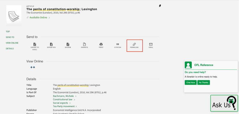
- Select the permalink icon. The permalink should appear on the same page. You know
it is a permalink if the URL begins with https://und.primo.exlibrisgroup.com/permalink.
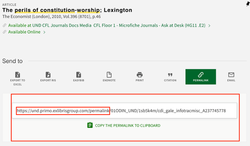
- Copy the link. You can either cut & paste, or you can highlight and copy.
- Go to Blackboard. Navigate to the content area you want to put the article in. Navigate
to the Build Content button at the top of your content area. Select the Web Link option
from the dropdown menu.
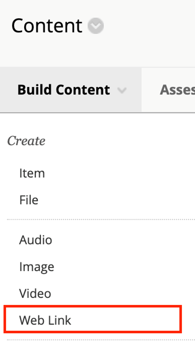
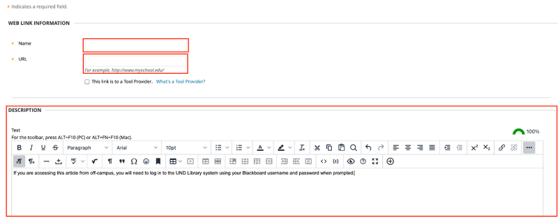
- This will open the page where you will set up your Web Link. You will have to supply
three pieces of information on this page.
- First, in the Name field, you need to give your web link a name. We recommend using the title of the article, so students can easily locate it.
- Second, in the URL field, you need to paste your permalink.
- Third, add in instructions for students who will be accessing the article from off
campus. They need to know that they will need to log in with their Blackboard credentials
when prompted.
Once you have created a permalink, your students will be able to select the link in Blackboard. This will direct them to the bibliographic record for the article in the database. There, they should be able to select the format that best suits their needs.
What is Reading Order?
The reading order of a document or presentation determines the order that a screen reader will read out content. Screen reader users can easily become confused, lost, or miss parts of the content entirely if the reading order is incorrect. Verifying the reading order is imperative to ensuring that all students have equal access to the materials. Even if objects in your document or presentation appear to be ordered logically, you should always manually check the reading order.
Reading Order Example
The following is a PowerPoint slide visually presenting a school lunch menu. The items on the slide are arranged in the order that we visually read them: A title, date range, table with days of the week, and a company logo. Listen to the following audio file. How does this example sound when read aloud? Keep in mind that a screen reader also needs to have heading information read aloud to understand where things are located on a screen or page.
Reading Order Screen Reader Audio File with Incorrect Table Reading Order
|
Monday |
Tuesday |
Wednesday |
Thursday |
Friday |
|
Hot dog |
Tacos |
Pizza |
Hamburgers |
Fried chicken |
|
Cole slaw |
Fiesta rice |
Garden Salad |
with ketchup, mustard, and pickles |
Potato salad |
|
Carrot sticks |
Corn Salad |
with Ranch dressing |
French fries |
with hot vinaigrette |
|
Orange |
Soft-serve ice cream |
Chocolate cake |
Apple pie |
Chocolate chip cookies |
Now listen to a similar table being read aloud, this time with the correct reading order.
Reading Order Screen Reader Audio File with Correct Reading Order
|
Monday |
Tuesday |
Wednesday |
Thursday |
Friday |
|
Hot dog Cole slaw Carrot sticks Orange |
Tacos Fiesta rice Corn Salad Soft-serve ice cream |
Pizza Garden Salad with Ranch dressing Chocolate cake |
Hamburgers with ketchup, mustard, and pickles French fries Apple pie |
Fried chicken Potato salad with hot vinaigrette Chocolate chip cookies |
What are the Benefits of Reading Order?
Correctly setting the reading order of your document:
- Allows text-to-speech or screen reading software to read information sequentially.
- Ensures that keyboard and screen reader users can navigate menus, links, and form field items sequentially when using the tab key.
SmartArt is a tool in Microsoft Office that turns text into visuals like flowcharts, hierarchies, and diagrams—perfect for making ideas easier to understand and more engaging.
SmartArt in Microsoft Word and Microsoft Excel
SmartArt in Microsoft Word and Excel is largely inaccessible due to the fact that it exists on a separate drawing layer. As a result, screen reader users cannot navigate or read the content within SmartArt. Instead, it is treated simply as a graphic. While alternative text or long descriptions can be added to improve accessibility, these workarounds often fall short—especially when SmartArt contains complex or detailed information. In most cases, it’s best to present this information using standard text, lists, or tables. Doing so ensures that all users, including those using assistive technologies, can fully access and understand the content.
SmartArt in Microsoft PowerPoint
SmartArt in Microsoft PowerPoint is generally more accessible to screen reader users than SmartArt in Microsoft Word, as it does not exist on a separate layer. While PowerPoint provides greater interaction with SmartArt content, it still has many accessibility limitations. Yes, users can navigate to individual SmartArt elements using keyboard commands to “read” the text. However, screen reader users may still struggle to understand relationships between objects—such as hierarchy or process between elements.
What makes SmartArt accessible?
SmartArt is considered accessible when users—especially those using screen readers—can meaningfully interpret both the content and the relationships between elements in the graphic. Accessibility in SmartArt can be enhanced by ensuring the following:
- Alternative text for the grouped graphic
- Alternative text for individual images
- Adequate color contrast
- Logical and meaningful reading order
Alternative Text
SmartArt graphics are essentially images, and (like all images) they require alternative text.
Alternative Text for Grouped Graphic
When applying SmartArt to your PowerPoint Slides, graphic elements are typically grouped together. This is meant to help maintain the reading order for the graphic. Since the elements are already grouped, you will need to assign alternative text to the overall graphic. This text should provide a concise summary of the graphic and explain any essential relationships or processes depicted.
- Tip: A long description is not required, since screen reader users can navigate into individual SmartArt elements.
Alternative Text for Individual Images
If the SmartArt contains standalone images (e.g., icons or photos), each of these must also include its own descriptive alt text. You can manage and edit these through the Picture Format tab within the SmartArt Tools menu.
Color Contrast
Not all SmartArt themes automatically meet accessibility standards for color contrast. It's important to verify contrast based on the WCAG 2.1 AA guidelines:
- Text & Images of Text: Minimum contrast ratio of 5:1
- Large Text (18 pt or 14 pt bold): Minimum contrast ratio of 3:1
- Logos: No minimum contrast requirement
If you need to adjust colors for all the elements within your SmartArt graphics, you may do so by navigating to the SmartArt Design Tab and then selecting Change Colors.
Reading Order
SmartArt will automatically apply a set reading order to it graphics. The order attempts to follow the same guidelines that screen readers do when reading content (i.e. left to right and top to bottom). However, this default order may not always align with the visual or intended flow—especially in complex layouts.
On a general basis, simplistic graphics with text contained in ordered blocks have a logical reading order that most screen readers can comprehend. Graphics with the following elements may cause issues in reading order:
- Graphics with photos: Photos often receive priority in the reading order, separating them from the context of accompanying text.
- Graphics with decorative shapes: Some graphics apply additional shapes behind text boxes to create a floating effect. These shapes are given priority over the actual content, confusing the information hierarchy.
- Floating Process Arrows: Many graphics contain floating arrows to denote the process and/or relationship of the data. These arrows are often read first, prior to the textual elements. This often disrupts the logical sequence of the data.
- Timelines: Dots, markers, and shapes on timelines may be read out of context, detached from the corresponding text.
- Symbolic shapes (e.g., +, -, =): These shapes help denote relationships in data. However, these shapes aren’t read out as signs in an equation. Instead, they are merely read out as “shape.”
Characteristics of an Accessible Table
Tables are more than just a way to organize information; they are a powerful tool for sharing information clearly and effectively. When designed with accessibility in mind, tables become more user friendly for all—including individuals with disabilities. Some of the key characteristics of an accessible table include:
- Simple Structure: Design simple tables, avoiding merged or split cells.
- Consistent Header Row: Ensure header rows are consistent across pages. Rows should not break across pages.
- Descriptive Alternative Text: Add alternative text or a detailed description for more complex tables. This text should convey the same information to a user that the table would.
- Informative Table Caption or Summary: Include a caption or summary that explains the table's purpose prior to reading the table.
- Sufficient Color Contrast and Font Size: Use high color contrast combinations and font sizes.
- Keyboard-Friendly Navigation: Organize the table so users can move through it logically using keyboard controls.
Create Tables with Accessibility in Mind
Creating accessible tables requires careful planning and thoughtful design to ensure all users can understand and navigate your data.
When creating tables, follow these guidelines:
- Use tables for data only, not for layout purposes.
- Build all tables in the original document. Avoid drawing, importing, or inserting tables as an image file.
- Use a simple table structure with a clearly marked header row and first column.
- Avoid using blank, merged, and split cells. These can create issues for screen reader
users, who may not be able to navigate the table in a logical reading order.
- For split cells: Merge the cells back together. Make any adjustments to the table you might need, including creating several less-complex tables.
- For merged cells: Split the cells apart. If the title of table appears in merged cells at the top of the table, move the title outside the table into a caption and delete out the row of merged cells. If need be, make other adjustments to the table, including creating several less-complex tables.
- For empty cells: Fill in all empty cells with text such as “n/a” “null,” etc.
Table Header Row
A table header row is the top row of a table that serves as a title for the categories of information in each column. Designers often manually bold this row to create emphasis, but it's important to mark headers properly in the code to ensure they are structurally identified. Screen readers depend on these structural headers to help users understand the table's organization and navigate its content accurately
Table Header Row Example

Benefits of Table Header Rows?
Marking table headers tells screen reader users how to read tables. If the table headers have been properly marked, the user is able to navigate table cells and hear which column they are currently in.
Properly marked table headers benefit all users, not just those using screen readers. When tables span multiple pages, correctly marked headers ensure that readers can keep track of the table's structure without needing to flip back and forth between pages. This improves clarity and usability for everyone.
Table Header Row Guidelines
- Have only one header row per table.
- Have only one header column per table.
- Avoid title rows in the middle of a table. Instead, break up the table into two (or more) separate tables.
Alternative Text
Alternative text (or alt-text) is the short, written description that typically appears in place of an image. For a table, the purpose of alt-text is to convey the same information and data to a user that the table would. This is especially important for screen reader users, as screen readers typically announce tables without context unless alt-text is provided. Without a description, users will hear only “Table” and won’t understand its purpose or content. Including clear and concise alt-text ensures that users can grasp the meaning of the table, even if they cannot view it visually.
Table Captions
Table captions provide a brief description of a table's content. Think of them as a quick summary of the table; they tell the reader the purpose of the table before diving into the details. It's important to know that captions are different from alternative text. Captions give a brief summary of the data, including where the data came from and/or who created the table. Meanwhile, alternative text is used to describe images in word for people who can't see them.
Color Contrast
If you have used shading to visually differentiate rows, make sure that the color contrast between the background shade is good enough to perceive the text color. This can be achieved by adhering to WCAG 2.1 AA's color contrast guidelines:
- Normal sized text should have a contrast ratio of at least 4.5:1
- Large sized text should have a contrast ratio of at least 3:1. Large sized text consists of an 18 pt font or higher or a 14 pt. font bolded.
Table Navigation
Accessible tables enable all users to navigate data smoothly using keyboard controls. A simple table layout is the best way to guide users through information smoothly. People should be able to navigate from left to right across rows and from top to bottom through columns without confusion. Clearly marked headers are especially important for people using screen readers, as they help explain how each piece of data connects to its row and column.
Resources
For help on creating accessible tables in Word, Excel, PowerPoint, and Adobe Acrobat documents, see TTaDA's Accessibility Resource Index.
Transcripts
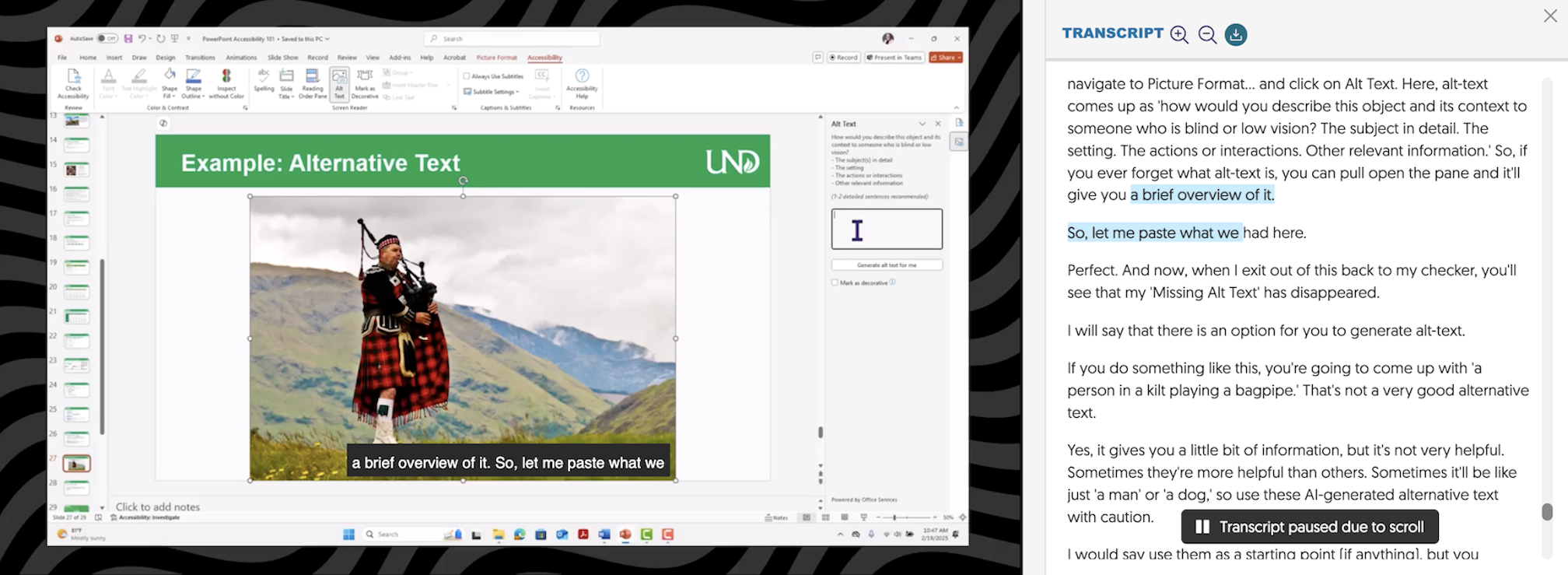
Transcripts provide an accurate text version of audio content, either for video or audio files. Transcripts are usually formatted as a downloadable document, most commonly in Word format.
Transcript Example
What is the Difference Between Audio Transcripts and Video Transcripts?
Audio Transcripts
A transcript is the only method of providing a text alternative for audio-only files. This can either be a downloadable document or text can be displayed alongside the audio file.
When audio files are embedded in another document, such as a PowerPoint file, a separate transcript is still needed.
Video Transcripts
Transcripts differ from captions in that the text is not displayed in sync with the video. Oftentimes, a transcript is viewed separately from its video file. Given this separation, transcripts need to include logical formatting (including headings). Transcripts also need to make sense on their own.
To provide an equitable experience of videos, synchronized captions are required; on their own, transcripts are not usually sufficient. However, there are cases where transcripts may be preferred or required. Having both available is recommended.
Who Benefits?
Transcripts can benefit deaf or hard-of-hearing users. They can also support many other learning strategies, including:
- Locating a specific point in a video
- Note-taking
- Learning new vocabulary
- Learning a new language
- Focusing
- Reviewing
- Searching for terms
What Guidelines Should I Follow?
Consider the following guidelines when generating transcripts for audio and video files:
- Textually describe the scene.
- Include relevant, non-speech sounds (e.g., laughter, applause, or background noise), as these elements are essential for a complete understanding of the content.
- Decide if you want a verbatim or edited transcript
- Verbatim Transcript: includes all sounds, including stutters, pauses, and filler words (e.g., “hmmm” or “erm”).
- Edited Transcript: cleaned-up versions prioritizing grammar and punctuation, while maintaining the original context.
- Add labels or names to differentiate between multiple speakers. This organizes the transcript, making it easier to follow.
- Review your completed transcript for accuracy and correct any errors.
- Break the content down into defined sections and topics to make it easier for readers to navigate and comprehend.
- Link the transcript file to its accompanying audio or video.
Are Automatically Generated Transcripts Accurate?
Automatically generated transcripts rely on speech recognition software. The accuracy of transcription may vary based on several factors: program software, audio quality, speaker dialect, and content complexity. To ensure accuracy, some post-editing may be required.
Resources
Generate transcripts in the following programs: