University of North Dakota
    • Admitted Students
    • Current Students
    • Families of Current Students
    • Faculty & Staff
    • Alumni
    • Email
    • Blackboard
    • Campus Connection
    • Employee Self-Service
    • Hawk Central
    • Degree Map
    • Zoom
  • Directory
  • Academics
  • Admissions
  • Student Life
  • Research
  • Athletics
  • Majors & Programs
  • About
University of North Dakota
  • Academics
  • Admissions
  • Student Life
  • Research
  • Athletics
  • Majors & Programs
  • About
  • Request Info
  • Visit
  • Apply
  • Request Info
  • Visit
  • Apply
  • Home
  • Academics
  • TTaDA
  • Academic Technologies
  • Digital Accessibility
  • Creating Accessible Content
  • Color Contrast
Skip Section Navigation
  • Create Accessible Content
  • Getting Started
  • Course Materials Show/hide children
    • Simple Syllabus
    • Textbook
    • Blackboard Ally
    • Vevox
    • Qualtrics
    • VoiceThread
  • Document Accessibility Show/hide children
    • Microsoft Word
    • Microsoft PowerPoint
    • Microsoft Excel
    • PDFs
    • Remediate PDFs
    • Remediate PDF Forms
    • Blackboard Utra Document
    • Accessibility Resources 
  • Common Accessibility Issues Show/hide children
    • Alternative Text 
    • Captions
    • Color Contrast
    • Descriptive Links
    • Headings
    • Long Description
    • Permalinks
    • Reading Order
    • SmartArt
    • Tables
    • Title and Language
    • Transcripts
  • Audio and Video
  • Online Meetings
  • Email Accessibility

Color Contrast

Color contrast is the difference in brightness between colors in the foreground and background.

Most people prefer good color contrast – it’s easier for everyone to read. If you’ve ever sat through a slide presentation with poor contrast or used subtitles on a movie where the contrast was not high enough, you know how frustrating it can be to not be able to access the information being presented. Poor contrast particularly impacts people with low vision and with color blindness.

Color Contrast Guidelines

When using color, it is important to consider the color difference between text and its background, text and images, and sections depicting meaning in charts and maps.

Color Contrast Ratios

WCAG 2.1 AA gives us precise guidelines for accessible contrast ratios on websites.

  • Images should have a contrast ratio of at least 4.5:1.
  • Normal sized text should have a contrast ratio of at least 4.5:1
  • Large sized text should have a contrast ratio of at least 3:1. Large sized text consists of an 18 pt font or higher or a 14 pt. font bolded.
  • Text in logos do not have a contrast requirement.

Best Practices for Effective Use of Color

  • Choose high-contrast color schemes. Warm and cool colors make for the best color contrast.
  • Black text on a white background offers the best color contrast
  • Avoid white text on a black background, as it creates a visual fuzzing effect known as “halation” for people with corrective lenses.
  • Avoid green-red and yellow-blue color combinations, as they present challenges to many with color blindness.
  • Use large text and simple fonts. San serif fonts are easiest to read.
  • Use bold instead of color for emphasis.
  • Don’t rely on color as the sole means of conveying information. Color should not be the only method used to indicate emphasis, heading levels, or links. 
  • Set text against solid backgrounds. Photographic and gradient backgrounds can make text difficult to read. 

Color Contrast Example

Here is an example showing how difficult it is to read text with insufficient contrast.
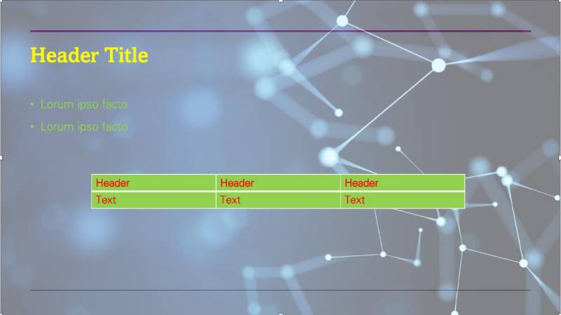
example of color contrast


Check Color Contrast in...

Use a dedicated color contrast checking tool to check color contrast in your files and webpages.

Tools for Checking Color Contrast 

Word

Ensure sufficient color contrast in Microsoft Word. 

Word

PowerPoint

Ensure sufficient color contrast in Microsoft PowerPoint. 

PowerPoint

Excel

Ensure sufficient color contrast in Microsoft Excel. 

Excel

Blackboard Ultra 

Ensure sufficient color contrast in Blackboard Ultra documents.

Ultra Documents


Resources

For more guidance on checking color contrast in Word, Excel, PowerPoint, and Adobe Acrobat documents, see TTaDA's Accessibility Resource Index.

Accessibility Resource Index

Teaching Transformation and Development Academy (TTaDA)
O'Kelly 320, Stop 7104
221 Centennial Drive
Grand Forks, ND 58202-7104
P 701.777.3325
ttada@UND.edu

We use cookies on this site to enhance your user experience.

By clicking any link on this page you are giving your consent for us to set cookies, Privacy Information.

Ready to Enroll?

  • Request Information
  • Schedule a Visit
  • Apply Now
  • UND.info@UND.edu
  • 701.777.3000
  • Instagram
  • Facebook
  • LinkedIn
  • YouTube
  • TikTok
  • Contact UND
  • Campus Map
  • Events Calendar
  • Community & Belonging
  • Explore Programs
  • Employment
  • Make a Gift
  • Campus Safety (SafeUND)
University of North Dakota

© 2025 University of North Dakota - Grand Forks, ND - Member of ND University System

  • Accessibility & Website Feedback
  • Terms of Use & Privacy
  • Notice of Nondiscrimination
  • Student Disclosure Information
  • Title IX
©